
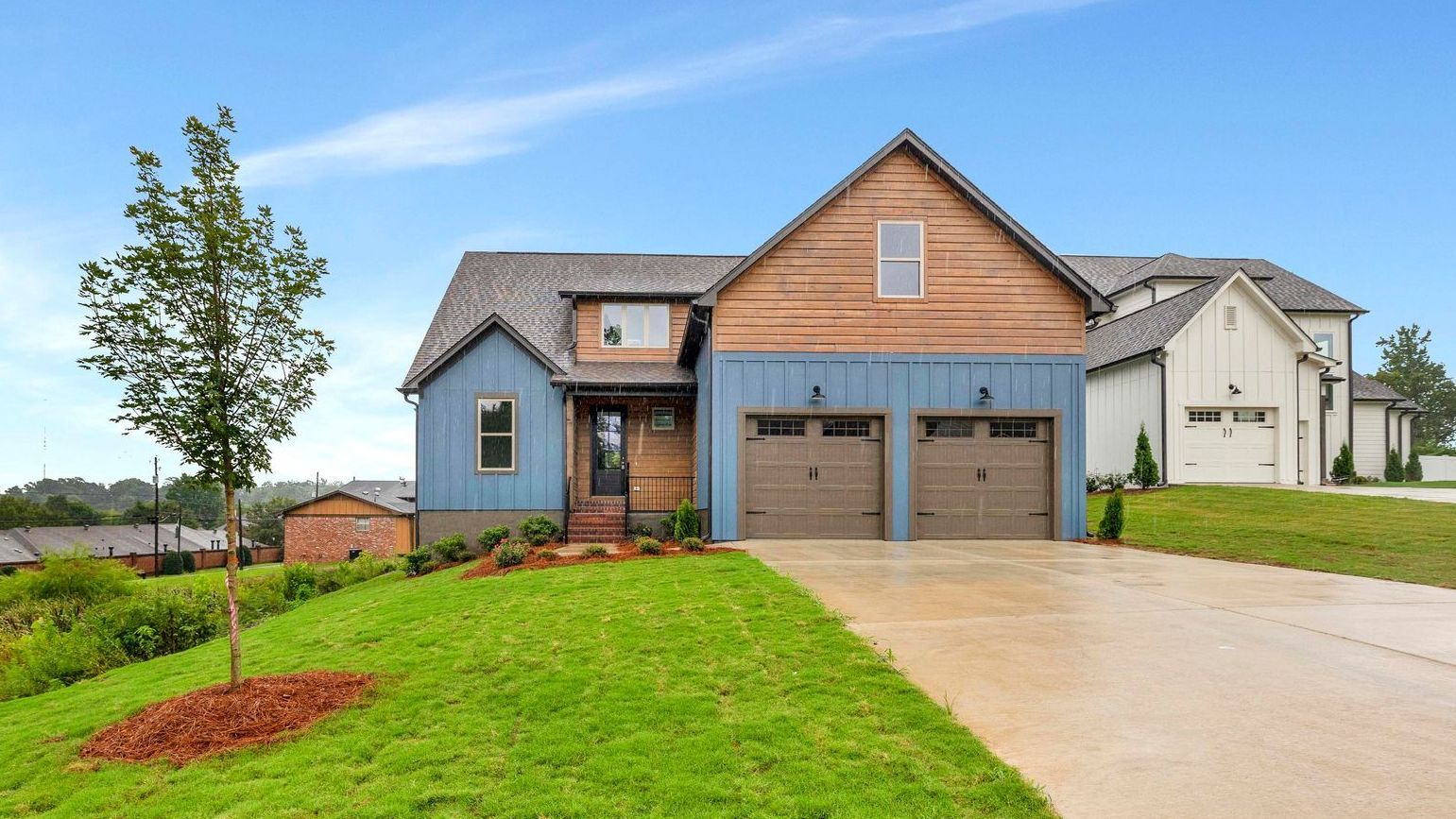
When I started designing Lot 23 at Spencer Preserve, I knew I wanted it to stand out. It's at the front of the neighborhood, and when people drive by I wanted them to notice it! To me, a standout design means that nobody has mediocre feelings about it. Love it or hate it, it makes you feel some kind of way.
The comeback of the midcentury modern aesthetic has absolutely stoked the fire of my imagination. I have never been a huge fan of the all white design. As a builder I see so many white walls between the sheetrock and the primer and the trim and the cabinets that it has always felt a bit unfinished to me. Don't get me wrong - I love a clean marble tile in a spa bathroom, but when customers choose color I get excited.
When I design a spec home I always try to add a little pop of something to make it unique. Something to make you remember "that house with the sage backsplash" or "that one with the black powder room!" I naturally gravitate to green and have used it in many shades in my designs, but I wanted to go blue with this one. But I knew I had to be careful to steer it away from that nautical beachy look many people associate with blue.
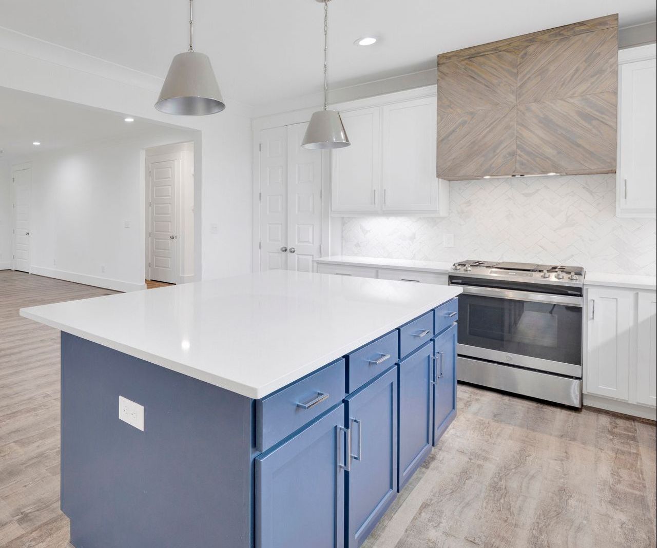
When I begin a design, I typically start with the kitchen. To me, a kitchen is where you will spend the most time as a family, so that space needs to shine! I chose a blue island for a big pop of color. It goes stunningly with chrome accents. I tend towards nice simple pulls. I kept the surrounding cabinets a nice white shaker to allow the eye to drift towards that hood.
Oh, that hood, apple of my eye, I love you so much! I knew I wanted a marble herringbone backsplash, and I decided to pull that pattern up to the hood. And it turned out even better than I imagined! Brian is frequently iffy about my design decisions until he sees them, so it's always fun when he sees something and says, "wow, that looks amazing!" He prefers beige and minimalist while I lean towards moody and maximalist, so wowing him is always fun, especially since this hood is so extra! Ha.
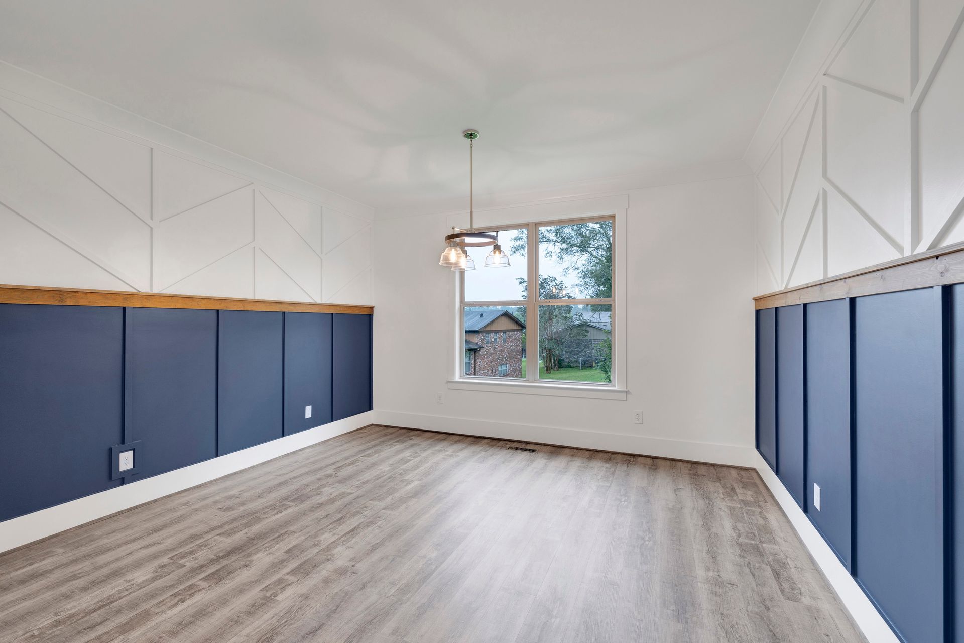
And since I don't have a "no that's too much" bone in my body, I kept on with the pattern and the blue right into the dining room. The cabinet company provided the Sherwin Williams color match for the island (seriously awesome that they do that) for the lower half, and we painted a nice bright white above to keep it feeling bright. With a stained wood chair rail and a funky pattern moulding treatment, there is nothing boring about this dining room!
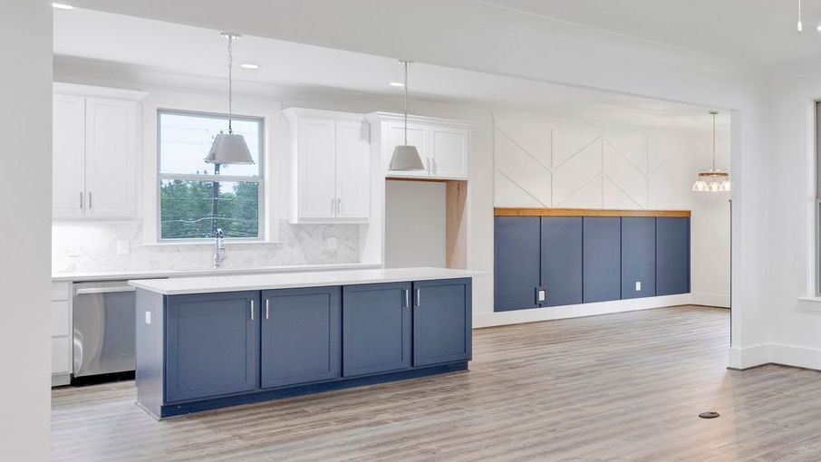
Admire the color match with me!
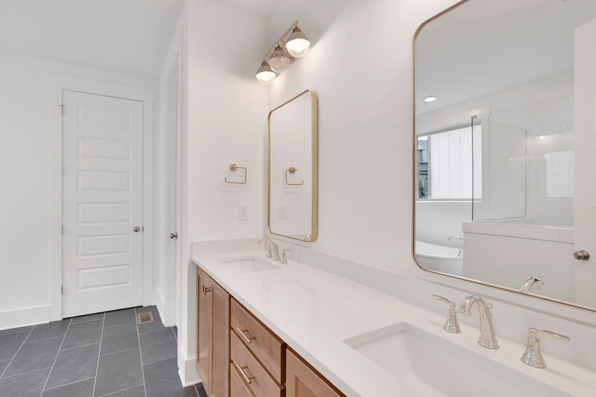
For the bathrooms, I wanted to do some mixed metals. Bathrooms can feel cold and impersonal. Mixing metals can give a space a lived in, warm feel. It feels more custom and less track home, doesn't it? My rule of thumb is to go with one shiny and one matte. For this master I went with chrome Delta Woodhurst® plumbing fixtures. The classic, clean lines of these fixtures will withstand the test of time, both with quality and trends.
But I wanted the warmth of a wood cabinet with champagne gold pulls and towel hooks. Using the t-pulls vertically as knobs really gives it that midcentury flare. And I searched high and low for a light fixture that would pull it all together. This 3-light vanity from Hinkley was a great find!
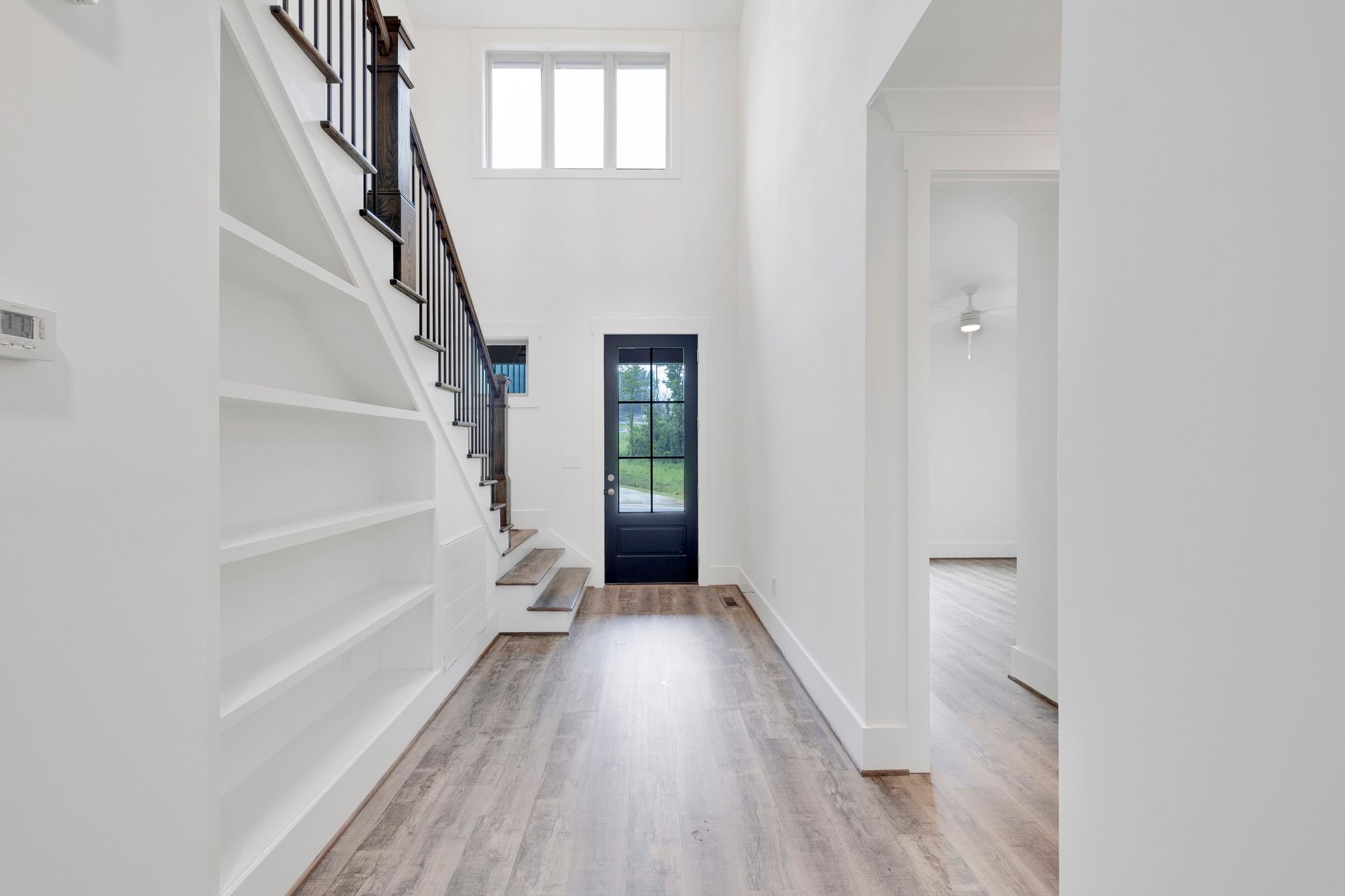
In the entryway I added some shelving under the stairs. Because I just cannot stand wasted space! This could be used to create a really pretty vignette, or for someone's book collection. (Or in my case- part of an extremely excessive book collection!) And when you look up...
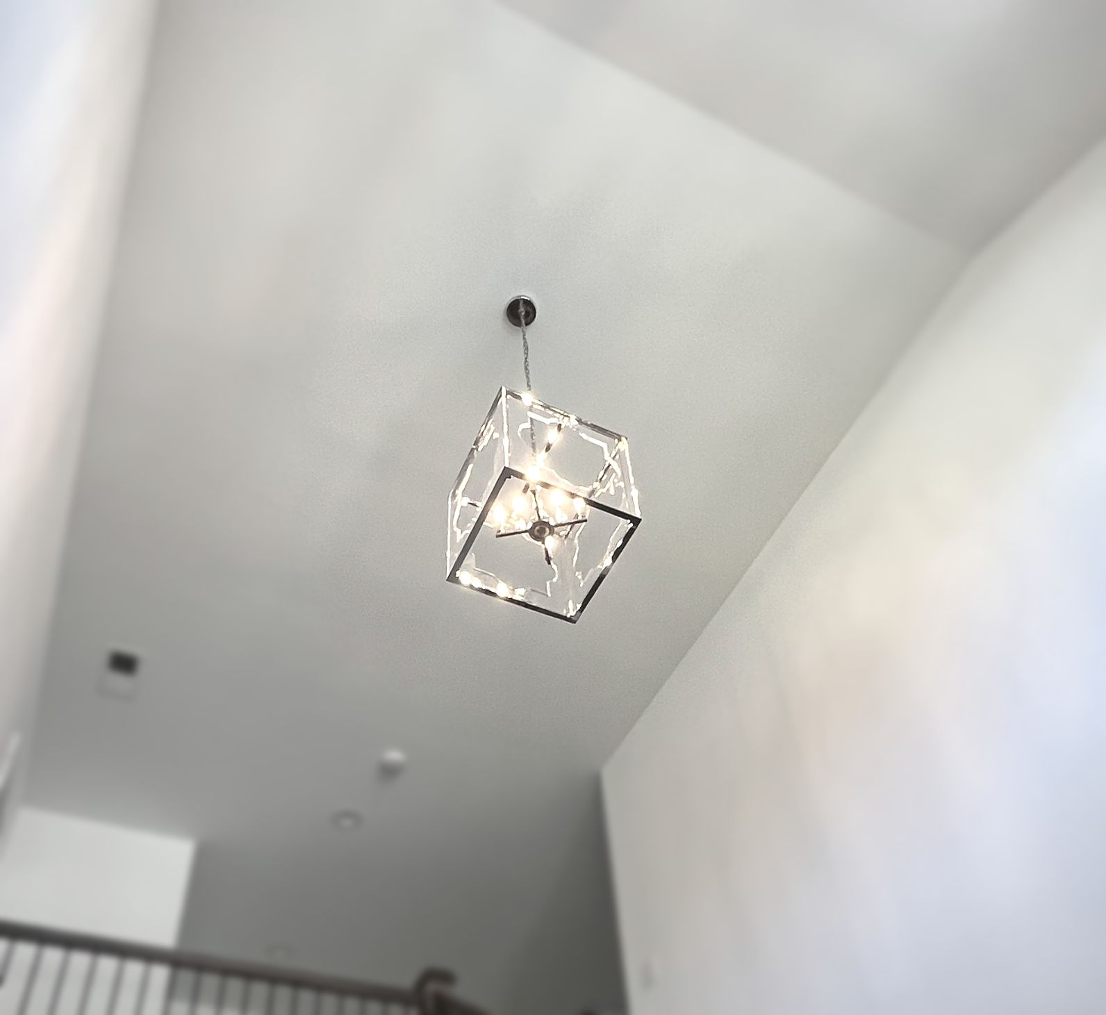
There's a gorgeous acrylic and chrome light fixture at the top of the foyer to welcome your guests, while providing plenty of lighting to get to the upstairs loft. Which is perfect for a second livingroom, playroom, or a teen hangout spot!
Not long after we listed this house, Benjamin Moore announced that the Color of the Year for 2024 was Blue Nova. And while I used Sherwin Williams paint, I was happily surprised to know that in the process of creating something modern but timeless, I managed to be trendy too!
So...what do you think of the Blue House?

